Now that we had the walls in place and clad it was time to add some of the prettier finishes to the basement. Overall I was going for a look that was light bright and neutral, allowing who ever was living down there to add their own personality to the space while have a well designed jumping off point.
I choose a mid tone brown laminate flooring with a slight grey tone to be the base of the design. Laminate was not my first choice of flooring, I was actually adamant that I wasn’t going to put a “paper” product down on cement floor. But as often happens with first plans in DIY projects, it failed epically and I had to go with the option B. I planned to lay down a foam thermal break with plywood and LVP (luxury vinyl plank) on top of that, but it turns out my basement is slightly damp in the middle. The foam just exacerbated the moisture and started to smell … bad! Thankfully we only did one room so ripping it up and starting again wasn’t too much of a set back. Plan B was to use a plastic dimple membrane under a floating floor allowing the concrete slab to breath and dry. I know option B won’t last as long but it fit our needs at the time and we will cross the replacement bridge when we get there.
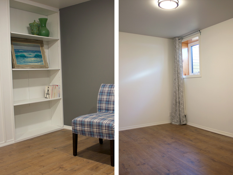
As I said before, because we are dealing with a subterranean space light and bright was the plan so the walls got painted a bright but slightly warm white. But an all white space can feel institutional very quickly so we added some pops of contrast throughout. The kitchen was a play on black and white, the wall in the main area got a coat of warm rich grey, and the ceilings in the bedrooms were painted a light dove grey. Our “feature walls” gave the space life and dimension, making it seem more inviting and thoughtfully built.
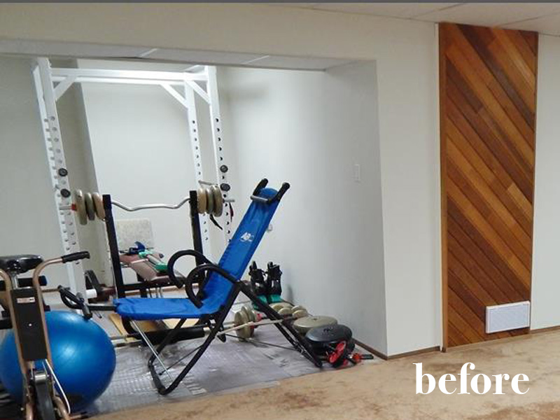
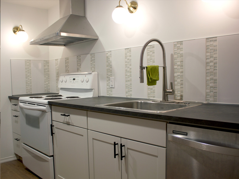
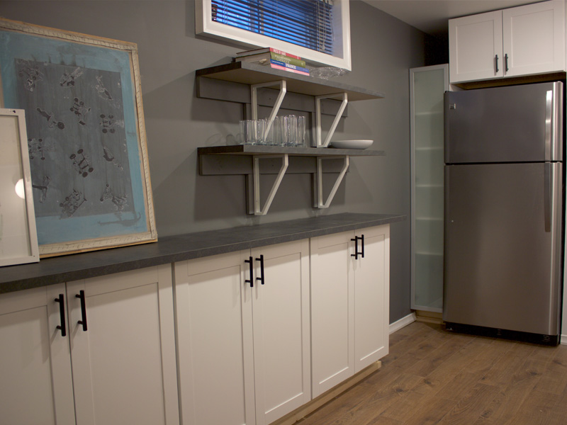
We created an open galley-ish style kitchen in a small recessed area the former owners used as a gym. The space was 7 feet wide, too narrow to do a traditional galley kitchen with lowers on both sides so we got creative. We used 24” lower cabinets on one side and 15” upper cabinets on the other allowing the space in between to breath while not sacrificing too much storage. We decided to do open display shelving on the shallower side and nothing but sconces and the hood vent on the other. It helped the kitchen feel more spacious and integrated into the living space while giving an almost sculptural quality to the hood vent. With no upper cabinets we need a little bit more storage though and created a suto built in pantry around the fridge with a short upper and a narrow Ikea bathroom cabinet at the end of the space.
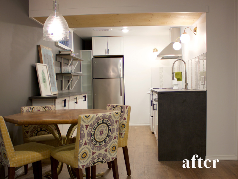
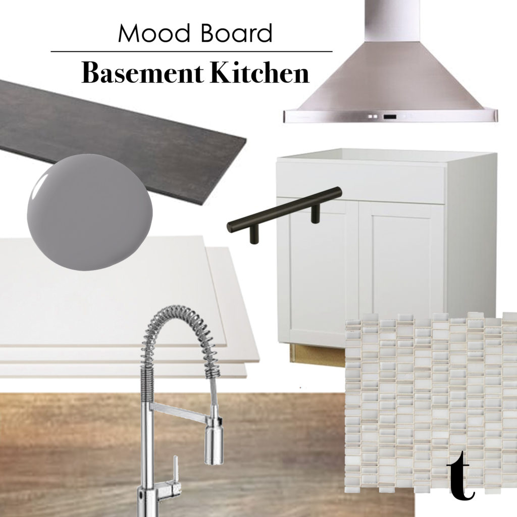
I choose classic white shaker style cabinets which we topped with a dark charcoal countertop with a waterfall edge and black hardwear. For the backsplash I wanted to make cheap tile look good! and used a very inexpensive white wall tile (left over from the bathroom) combined with a stacked stone mosaic (that I got on sale) and laid them vertically in repeating lines. The vertical tiles helped elongate the ceiling height and contrasted the strong horizontal lines of the countertop. I grouted it all with a bright white grout unifying the tiles and making the backsplash read as repeating lines of shiny and texture. Brass sconces from Ikea topped the whole thing off and brought a little warmth and bling into the space.
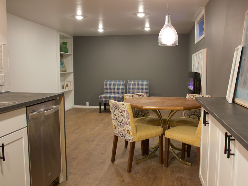
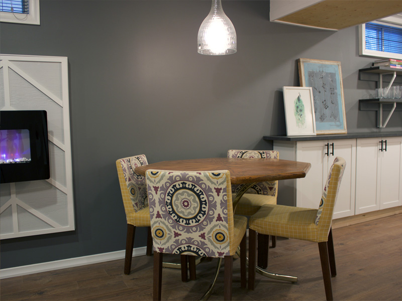
We hung a pendant light in the “dining area” and installed an electric fireplace with a geometric surround in the main room. The fireplace not only helps to keep the suite extra cozy but I think it’s a step most landlords wouldn’t include but it’s those extra steps of feature walls and blingy fireplaces that make a rental suite a home. I didn’t want to create a space I wouldn’t be proud to live in myself and I would be quite happy down there. In the next post I’ll show you the downstairs bathroom and extra steps we took with the closets.

Leave a Reply